

Updated Parish Brand Identity
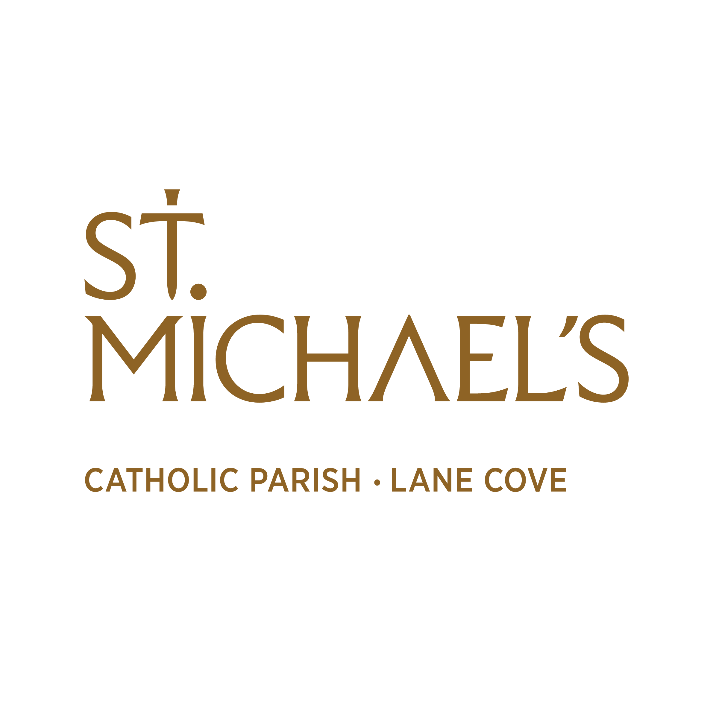
Many of you will have noticed the new St. Michael’s branding slowly rolling out across the parish. Consisting of stable logos, graphics, avatars, colours, and fonts, this fresh design language seeks to update our look with an iconic brand identity that will serve us well into the future.
Designed by Cheyne and Kobus de Beer from See And Co. design agency, the main logo embraces the heritage of the Catholic Church appearing as though chiseled in stone. The ‘T’ makes for St. Michael’s sword pointed down as if striking the devil and at the same time forms a Cross. The stylised ‘A’ points up, directing attention to God. Light shining down from Heaven is picked up in the detail on the cross-bar of the ‘T’ and ‘lights up’ the cross-bar of the ‘A’.
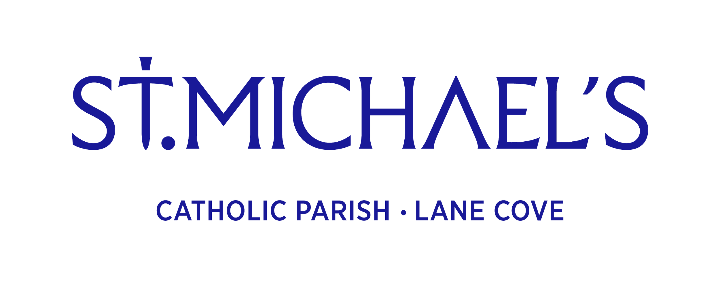
The logo operates as somewhat of a monogram, on the one hand it is readable and at the same time it is just simple enough to form a symbol. It commands the practical advantage of retaining its clarity even when reduced in size. The ‘.’ providentially unites the ‘stacked’ version of the logo. The avatar is a handy, simple sword extracted from the main logo and makes for a very striking image.



The primary colours, Royal Gold and Royal Blue are colours historically associated with St. Michael, the blue also providing continuity with our previous parish logo. These colours are supported by a secondary silver and a warm Gaudete Rose—the ‘pink’ vestment colour we only see twice a year in Advent and Lent.
We’re very excited to have a new look and feel for the parish and while the main body of work is complete there is still a little development to come. Over time we look forward to updating the parish signage and rolling out merchandise like shirts, hoodies, coffee cups, caps, holy cards and stickers so all our parishioners can show their colours. We are grateful to our designers whose love of God was the impetus for this excellent work.